Every now and then a truly unique project comes along..
Like when our amazing client Littlehampton Bricks and Pavers asks:
“Can you design us a Wine Label for one of our ranges of bricks?!”
So here’s the full story.. Littlehampton Brick Co is a family run and owned business who’s been around for over 100 years. They have managed to survive through many up and downs of the market as well as the housing collapse of the mid 2000’s which as you can imagine totally decimated the entire industry almost overnight.
Despite having the best product on the market (truly) they do 100’s of other things which keep them competitive with the other manufacturers in their market whom are all far larger companies. One of those little things is that every year around Christmas time they like to send out a bottle of wine to some of their clients and associates. It’s a small gesture but an appreciated one none-the-less.
They have named this yearly bottle of wine ‘Old Red’ which is a very popular line of bricks and pavers they manufacture. You can view old red bricks and pavers here
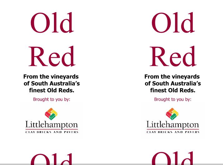
In previous years they would buy a nice locally made clean-skin blend of red wine and affix their own label to it. (A clean skin is just a normal wine which hasn’t been labelled as a certain brand/blend) Their method for this however is that they would just write up the label in a word document and print them on a4 paper in their office then glue them to the bottles. -So that’s where we come in!
This year they wanted to really make an impression and have both a professionally designed label as well as have the labels properly printed off-site.
Here’s what their old label looked like:
Not Bad, right?
While their ‘old’ label wasn’t bad, there was definitely some room for improvement and we were very excited to have a go!
Some of the criteria included:
- Keep it simple
- Don’t make it too different (ie: keep it recognisable)
- Something which suits the brand
Fair criteria to operate within! So we got to work…
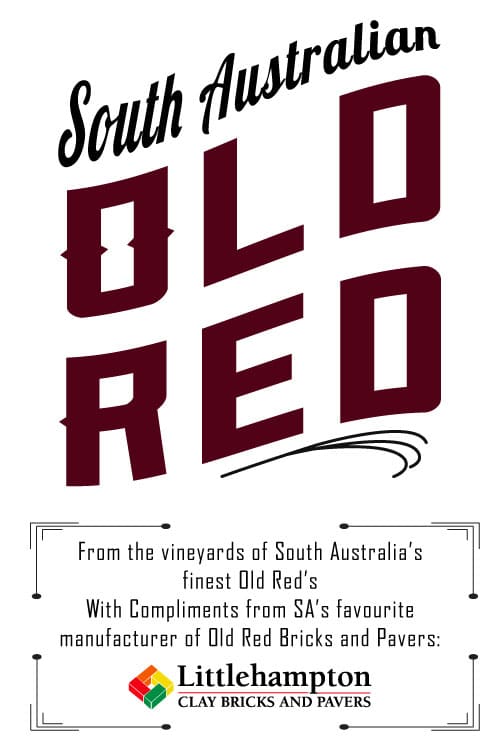
We presented a choice of 3 different labels. Each one different, yet similar in some ways..
Option #1
Option #2
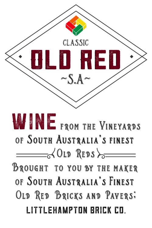
Option #3
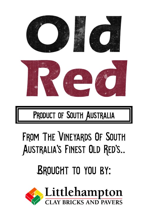
Those were the 3 options presented, as well as the caveat that we could mix-and-match elements of each design to suit…
However, THERE CAN ONLY BE ONE WINNER!
It was put to a vote within Littlehampton Brick Co and they chose…
Design #2!! (To our delight of course!)
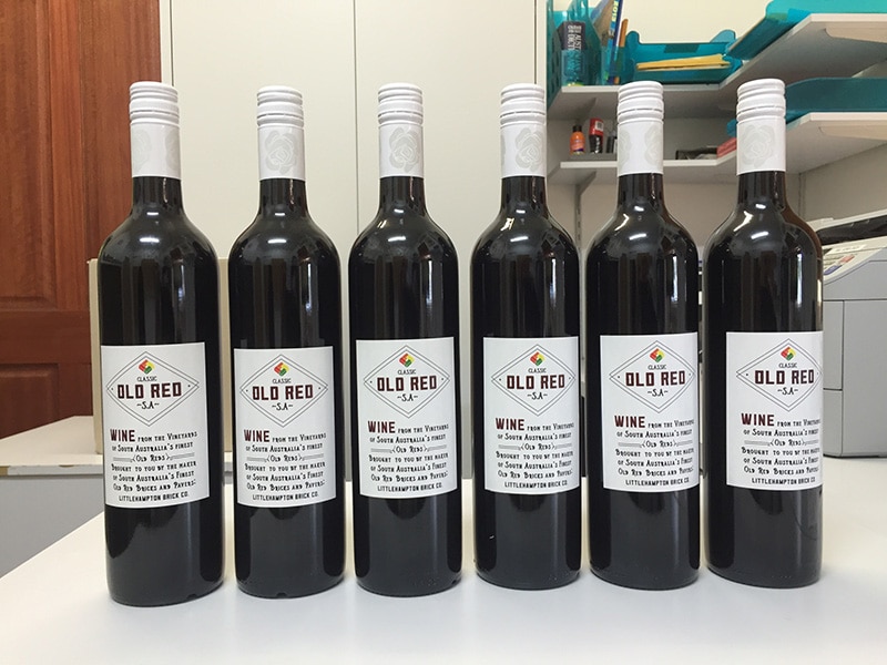
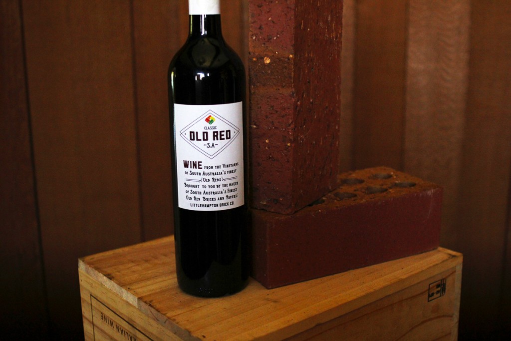
The decision was unanimous, and they didn’t even need any changes! Happy with the design as it was they quickly had the stickers printed and sent us the above photo of the fist batch ready to be sent out.
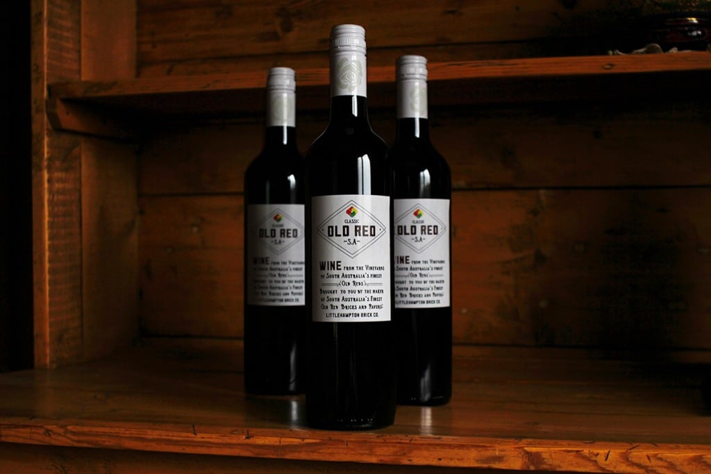
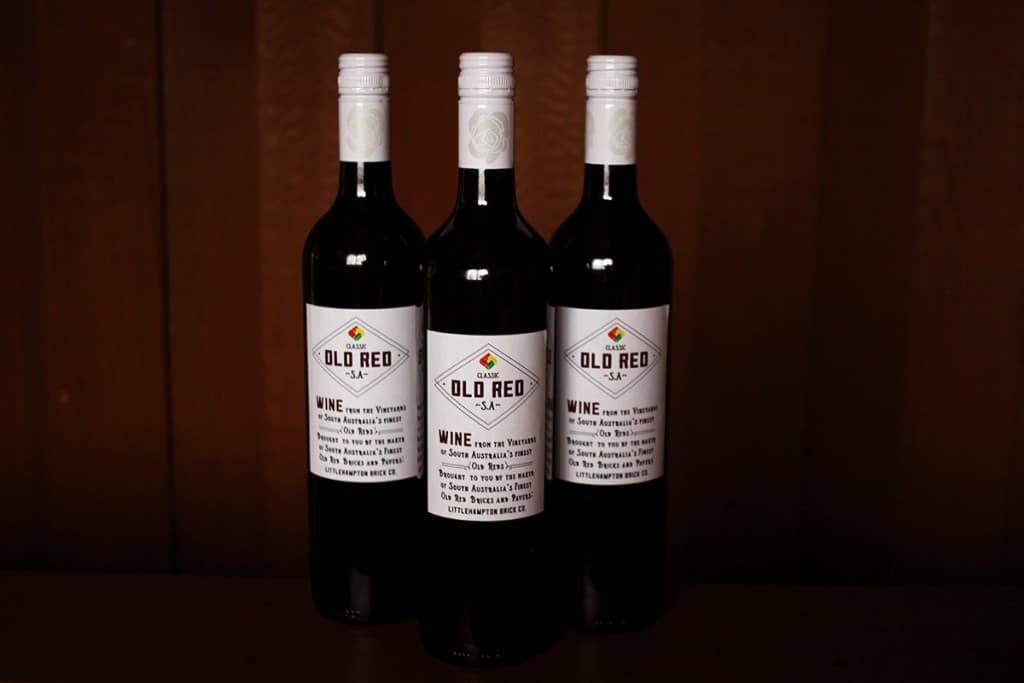
We thought they looked great, so great in fact that we managed to steal a few bottles to do a product photography shoot! (ok, we didn’t quite ‘steal them’ we borrowed them for a day under the promise that they came back full not empty!)
Here’s a few of the shots we took:
Do you like the designs? Which was your favourite? Comment below!

