A graphic designer walks into a bar… And soon realises how difficult it is do re-design his own work.. Then drinks the bar dry…
AHOY!
Logo design is difficult.
For a number of reasons…
It’s normally personal to the person or business it represents, it also needs to be true to the brand/business and needs to appeal to a wider audience (ie: clients/customers).
Combine this all with a bunch of other variables as well as the fact that most people have no idea what they want or like until they see it and you’ve got a recipe for disaster.
There are always exceptions to the rule. But they are generally just that; exceptions.
For example the first logo for Recal Media was an exception:
The original logo/name story (shortened):
This logo was an exception not because it was particularly outstanding, but because it took less than an hour for me to put together.
It’s a long way from my best work, but it did the job for a solid 4 years. The logo needed to be finished quickly because the cut-off time for when I could order business cards was just hours away -or they wouldn’t arrive in time for an important event I was attending. I had a few quick steps which brought the design together
- The original name wouldn’t do because my a close friend said: “It’s too long, and no one has any idea what the word Recalcitrant means, therefore it’s stupid and should be changed”.
So Recalcitrant Media instantly became Recal Media. PRON: “Ree-Cal”
2. I like nautical stuff, so lets add an anchor and ship.
3. Choose a distinct font and slightly modify a couple of letters. (I chose to modify the R and M)
4. Colours: Somthing commonly used together by sports teams and other organisations which won’t seem too fancy or weird and is generally non offensive? Red, black, White.
DONE!
Fast forward 4 years of never getting around to updating it because we’re too busy working on clients’ logos, films and photography… and that brings us to a couple of months ago when we ran out of the most reason batch of business cards and decided the wouldn’t be re-ordered them until we had the new logo.
Logo 1: <1 hour, Logo 2: >50+ hours!
Call it writer’s block, designer’s block, lack of inspiration, cognitive dissonance, being too close to the subject matter or whatever you like.. but what seemed like an incredibly simple task quickly got way out of hand!
Let’s start with the criteria:
- Want to keep nautical elements
- Would like a ’round’ version of logo since many websites/design elements require one now-a-days
Optional extras:
- Old-school motorcycle brand styling incorporated
- Badge style
- Different colours
Here’s an example some elements we liked:
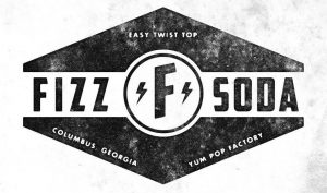

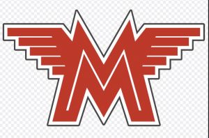


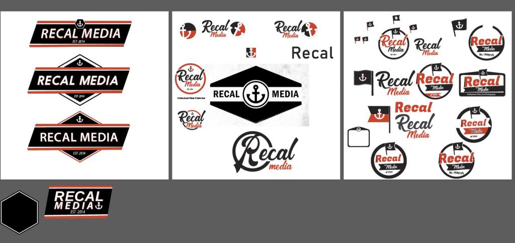
Then some very early designs and playing with new styles:
After spending quite a few hours on these designs and many others we decided we were certainly too close to the subject to be creative or objective and decided to open an online competition to other designers..
Of the 138 entries received, almost all of them were very underwhelming and many of them were clearly stolen from templates and other designers. Some even used old designs which they had done for different clients and just changed the words!!! **This should serve as a warning to anyone looking to run an online logo competition, do plenty of due diligence on your artist and the design.**
After being very underwhelmed with the vast majority, of the 138 there were probably around 8 viable options from maybe 4 designers.
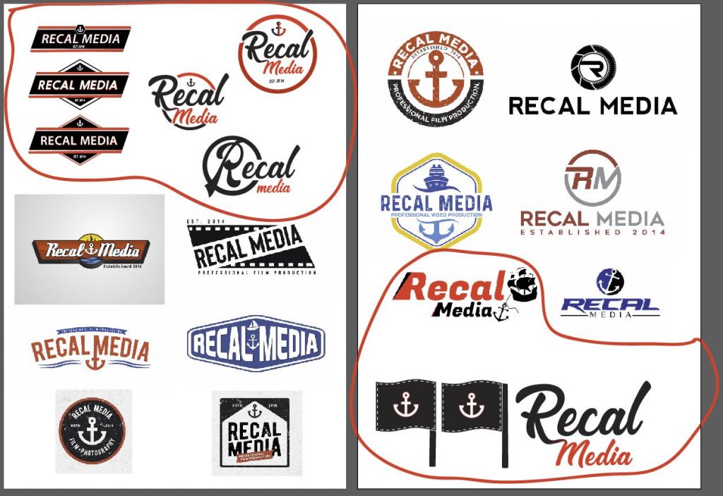
These are what were found to be some of the better/on-topic designs mixed in with some which we were still working on (ours=circled):
Eventually we realised that although a couple of the designs from other designers might be ‘usable’ they probably wouldn’t be unique, nor would they stand the test of time.
So like a gambler who’s sunk too much money in the pot to walk away from the table, we dug back into designing. (In this case we had sunk time in lieu of money, but many would argue they are one and the same anyway.. Plus we lost the money on running the online competition too!).
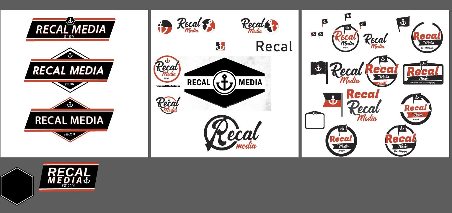
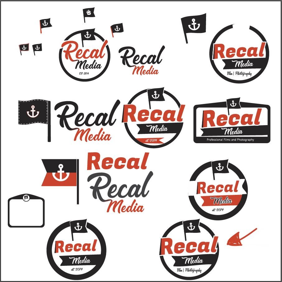
Here’s a neat-ish version of how nuts the ideation screen got towards the later stages:
Then the final stages:
A winner emerges…
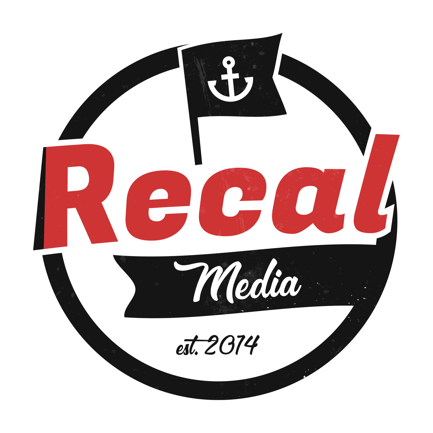
Standard Main logo:
Slightly grungy version, because why not
Single Colour versions:
We still need a ‘horizontal’ version for lots of things like websites and occasional print media, so we just grabbed elements from the logo and threw them next to each other in a similar layout-style to the old logo!
What do you do once you’ve spend far too many hours doing a simple logo re-design for your business?
You spend a few more making a ‘new logo unveiling video’ of course…!
(Turn sound on to hear fancy sound effects!)
Once you’ve done all that, write a long-winded blog post about it like this one likely to never be read by anyone!
Until next time!
Want to work with us on your graphic, film or photography project? Just email: contact@recalmedia.com or get in touch here
