Logo Re-design project
Sometimes businesses don’t need a totally ‘new’ look, sometimes they just need a few improvements.
This was much the case with Electronic Form 1 Company, when they approached us for a new logo design.
After looking at their ‘old’ logo our opinion was that it was actually not bad and that designing a new logo from scratch was actually not necessary.
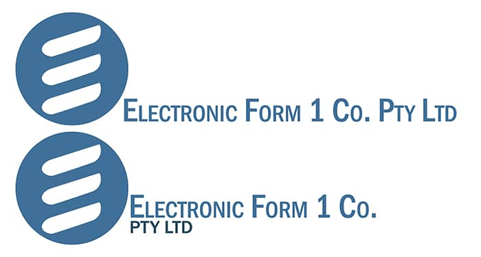
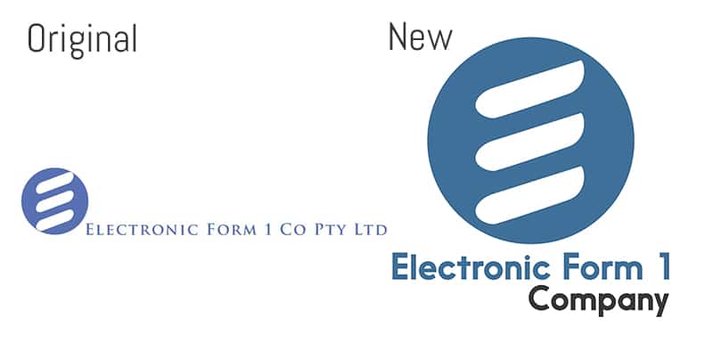
Here’s the original logo:
Things we liked about the logo:
-The ‘E’ Symbol
-The colour
Things we wanted to improve:
-The font
-The layout (it’s far too wide and thin)
-The name (if possible to shorten it)
-Enhance the ‘E’ Logo slightly
The first re-design
As with many first drafts of a re-design, we tried to stick close to the original idea with a few minor improvements. This was in part to reduce initial shock-factor of something new and because the E Form 1 team wanted to see how it would look with all the original text and layout, just updated slightly.
Here’s the first draft(s):
Changes we made:
-New round ‘E’ logo (made the inner white strokes a unique shape)
-New colour(s) (slight change from the original)
-New font
-New layout option (Pty Ltd below)
Clients’ Feedback for V1:
-We like the shape changes (yay, we do too!)
-Something still doesn’t sit right, maybe our business name is too long!
-Most of the time we refer to it as “EF1” or “Electronic Form 1 Company” can we try with those names?
-Maybe try a different layout also?
Good feedback! We agree that the name could be shortened/changed. Here’s what we came up with based on the feedback:
Second Draft(s):
Changes we made:
-5 different layouts
-Different fonts
-Different versions of the company name
-We made the cursive font one (last image) just to contrast the others as an example.
Clients’ Feedback for V2:
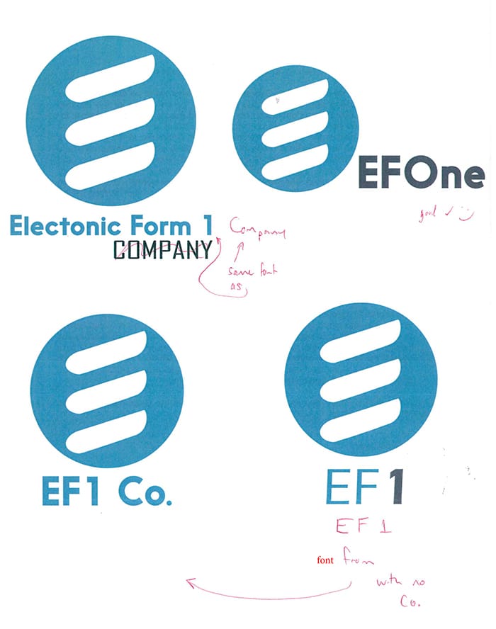
-We’re pretty much there, lets just see some with these changes (attached document)
*This is a snapshot of the attached document*
It’s always super helpful to print off designs and physically write on them, it also makes it very clear and easy for us to follow the instructions.
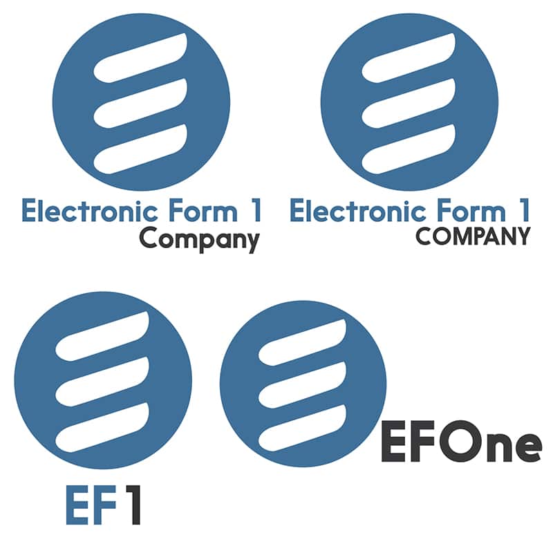
Third Draft(s):
Changes we made:
-Top left: All the same font, as requested
-Top right: Same as top left, but with all-caps for ‘company’ just to see how it looks
-Bottom left: ‘Co.’ removed, and font from ‘other’ design used as requested
-Bottom right: slight size and layout changes
And the winner is…?
TOP-LEFT!
We LOVE the result! It definitely looks more modern and enhances the company image. So here’s them side my side:
A great new look:
